Monday, 18 March 2013
Wednesday, 13 March 2013
Friday, 1 March 2013


Name designs
Name designs

I came up with this design as it stands out using a simple colour scheme and block capital text. I feel that this will be in keeping with the magazines theme and music genre. The word 'Overload' constitutes the excessively loud sound of rock music, it gives off signals that the magazine is in keeping with times, it is young informal and fun.

Double page spread analysis
Double page spread analysis

This double page spread features the band 'U2'. The majority of the two pages is taken up by the low angle, mid shot picture of a band member gazing away from the camera. This body language/shot connotates importance. In the background bright lights are shown to show fame and again importance. Overall it is a bold picture which makes a statement about the bands attitude.
The quotes in the text are highlighted in orange which will aid the readers in finding the information they want to read. The writing and overall look of the pages fit into a general colour scheme which is understated yet still sends a message to the reader that this band is big.

The other half of the page is taken up by a statement which is well known, this statement links in the the band name of 'Them crooked vultures'. The picture of the bird across the statement also fits in well with the general name of the band.
The colour scheme is dark and moody, possibly connotating the style of music. The red white and black fit together well and also go with the masthead of Q magazine.

This final double page spread comes from the Kerrang magazine and features the band 'my chemical romance'. like the other double page spreads, it features a main image that takes up about a page. In this image the artist is looking down, with a serious look about his body language, which signifies the genre of this music to be heavy metal/ rock. This idea is complemented by the other images of the band looking very serious and passionate about their music, the images are black and white which helps emphasise this idea.
The general colour scheme is simple as it only uses one strong colour, red, along with shades of black/ grey and white. This gives an element of class to the page.
Contents page analysis
Contents page analysis

The logo is in the corner and in red to keep up the brand identity. Bands are displayed in the left hand side in red to stand out. The page numbers are featured next to them making the layout of the magazine clear. The sub headings are featured on the right in capitals and stands out against the black background. similarly, all the artists names are in black, with the page numbers in red, it makes the magazine easy to follow.
The subscription advert at the bottom of the page is in yellow which draws the readers direct attention as it is different from the rest of the page. the advert attracts the reader by giving them substancial savings and an email address to make it easy to sign up. The pictures are longs shots with red in the background to give the readers a suggestion of whats to come inside.

The contents text fits in with the colour scheme of the brand, these colours will be seen as the magazines signature colours. The articles on the right are seperated into their own categories and fit alongside the theme of the magazine. This layout makes it easy to understand for the reader, and allows them to pick out what they want to read.
The subscription offer at the bottom right offers discounts for the magazine. showing discounted prices attracts the reader to sign up to this subscription.
The main picture of the band shows a spoof type image that connotates a laid back attitude of the band. showing that these artists can have some fun. The other images of the page are possibly the main articles as they attract the attention of the reader.

This contents page has a gernerally dark feel to it, which goes hand in hand with the gothic type band. The subheadings are categories that make the magazine well layed out.
The green subcategories go well with the other green elements of the page which suggets that this could be the signature colours of the band or the magazine. In the main image the lipstick of the girl stands out against everything, attracting the reader to the main article.
Name ideas

This is a collection of ideas for the name of my music magazine. My chosen genre is electro music and the words i found fit in with that type of music. My favourite in particular are 'overload' as it potentially could get the reader to feel like there is an overload of music/ information/ pictures.
Existing names
Existing names
NME: NME stands for new musical express, which states excatly the purpose of the magazine. The general feel of the magazine is a down to earth and straight to the point, the masthead signifies this.
Kerrang:The word kerrang sounds like a guitar beinging smashed on the floor which is highly ideal for this music magazine.
Rock sound: Rock sound does what it says on the tin. it is a very straightforward name for a music magazine and gives enough information across to the reader for them to know what it is about.
The majority of music magazine go along with names that are associated with musical sounds. These names are also associated with the music that is shown in the magazines, for example Kerrang mainly presents rock music.
Other magazines move for a different approach. Rolling stone is a magazine names after the famous band that is known for being exiting and well known, This gives the magazine more credibility with the readers.
Mastheads
The colours of the new NME masthead are the signiture colours of the magazine ,the red black and white, also these fit well with the music being promoted, for example blues and yellows wouldn't really tell the customer that this is a serious rock magazine, whereas the red black and white emphasise that. The mast head looks bold and stands out from other magazines on the shelf. Its a simple yet effective name its catchy and in some ways reflects the muisc being promoted.
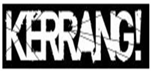
The Kerrange magazine is very simple,it only consists of white text on a black background which stands out at the viewer. The text has a 'shashed' look on it, looking like a broken peice of glass. This relates to the type of music that kerrang issue in their magazine, rock music. while it may not be the most bold eye catching magazine on the shelf it will attract people who listen to this genre of music.

The new Rock sound masthead is designed in the shape of a volume knob. This fits in with the general theme of the rock genre of music, associated with guitars, amps etc. The main colour is red which stands out against nearly every other colour. the colour red is often associated with rock music as it is bold and in your face.
Magazine cover analysis
Magazine cover analysis

This magazine cover attracts the eyes by way of the vibrant tribal design mixed with the band members. The bold title gives clear indications of the bands importance. the colour mix of red and blue mixes together to make it eye catching. The red 'sticker' type features with band names in grab the readers direct attention to what is featured in the magazine. The subheadings are behind backgrounds that make the capital text stand out, They also fit in with the general colour sheme of the magazine.

As with the last cover the title stands out to the viewer and the contrast of colour shows the genre of the band. it seems dark yet exiting much like their music style. The eye contact of the band members almost 'looks' at the audience as to grab their attention. The main image of the backround shows the band with serious faces connotating that their music has a meaning.

The main image of this cover brings attention to itself by seeming creepy, the red and black emphasises this significance. The main atricle of the page is headflined in yellow and stand out against the rest of the magazine. The two other articles have pictures and bold subheadings signifing that they are important parts of the magazine


Target audience research
Target audience research
A survey took placed to ask people of different age groups if they listened to indie/ rock music. The majority of people that said they do listen to that music were aged 16-25, also there was hardly any different in the gender of people who lisiten to indie/rock.
The music magazine NME claim their target audience to be aimed at 16-24 year olds. Their audience is 66% male and 34% female, showing that males are more likely to be into this genre of music.
People who read such magazines are likely to be students, socialise with friends and go to gigs, own an ipod or mp3 player, feel that music is a large part of their life, wear skinny jeans and logo t shirts, shop and topshop and HMV, or like to play an instrument.
Proposal
Proposal
Type of magazine
my music magazine will be based around the genre of rock n roll/ metal.
Frequency
It will be a weekly magazine
Possible stories/ Content
Sub focus new single
Upcoming gigs
Top ten list
Photoshoot - poster
Mood
Laid back yet exiting
Fun yet informative
Positive criticism of bands
Style
Unique features
App/ website
Interviews with bands
Readers thoughts - readers can post in their say about the events of the previous magazine
Marketing methods
Freebies such as CD's with exclusive tracks and artsit interviews
Discounts on festival tickets
Target audience
My target audience will be of both genders in their teenage years up to around 40. This is the widest spread of people who listen to rock music. The writing style will be fun for the younger generation but not too immature for the older generation.
Key images
Key images
Famous artists
New bands
QR code
Photo style images
Text boxes
New bands
QR code
Photo style images
Text boxes
Main feature
Mechanical evolution - the main band for the magazine in which we will use images taken from our photoshoot.
Mechanical evolution - the main band for the magazine in which we will use images taken from our photoshoot.
Audience, Representation, Intitution
Audience
All magazines are genre specific, and each genre has a certain target audience. Mainly it is categorised by age or gender. For example NME is read by more men than women. The reason why these people read these magazines is usually because of their social class/ background or peer group that may also listen to the same music. Fans of bands featured in the magazine will be more inclined to purchase it. however, people who are not fans will be more likely to read it online and not have something physical to keep. Websites are infinite and contantly updated therefore magazines just cant compete.
Representation
Eveything about a magazine will signify its genre. We can tell the attitude of the atrtists by looking at the photos. for example in a rock magazine the artsits will usually have blank faces and not looking at the camera, representing a laid back/ emotional attitude. Artists are ranked on what they wear, where they perform, and the awards they recieve. If a well known artsit is playing at a big venue like glastonbury, readers will be more inclined to buy the magazine to read about it. Awards like a grammy is considered to be a higher status of award than say NME music awards. Fans of bands love awards and are especially more likely to read about it if their band has recieved one. The more impressive it sounds the more readers will read.
Institution
As magazine companies cannot compete with the online world, they must join them. Nowadays magazines will have a facebook account where people can keep up to date on the companies movements. Also they may have a twitter feed so they can be followed. The magazine will have a website with all the news which is constantly updated. Fans who are loyal to the brand will follow their movements and buy their magazines.
Production log 8/2/13
8/2/13
Today i continued my music magazine and managed to complete the double page spread. The contents page still needs some adjustments to get it up to scratch to a standard of a real music magazine. i continued to add all the pages to one document and will start working on issuu.com to make the magazine stand out and look like a virtual magazine.
Production log 1/2/13
1/2/13
Today i finalised the creation of my music magazie front cover. I started developing a contents page and a double page spread. The design needed a little more exitement so i added a few more elements to the front cover for example exclusing offers.
Today i finalised the creation of my music magazie front cover. I started developing a contents page and a double page spread. The design needed a little more exitement so i added a few more elements to the front cover for example exclusing offers.

Production log 10/10/12
10/10/12
In todays lesson i focused upon my double page spread analysis. In which i picked up images from two very different magazines. Reviewing these double page spreads gave me an isight into how magazine companies use certain elements to engage an audience of people.
Production log 5/10/12
5/10/12
Today i wrote about the codes and conventions of magazines, these ideas were generally specific to rock magazine such as Kerrang. This was a task given in class to help show the uses of a magazine, and what elements inside it would attract readers.
Production log 28/9/12
28/9/12
Today i started to analyse contents pages of different magazines such as NME, Kerrang and Rock Sound. This was a task given to illustrate how magazine companies keep their readers occupied throughout the magazine. There are many elements of a magazine contents page which attract customers. For example a colour scheme to fit in with the masthead, or pictures that are relavent to the music genre.
Production log 24/9/12
24/9/12
Today i started producing the analysis of cover pages of the NME magazine. We were asked to talk about the main features of the pages and decode what things attract readers. I picked covers of NME which included bands which i particularly like. I found it difficult to find ways of explaining what was going on in the covers.
Subscribe to:
Posts (Atom)